-


Follow Us


It took three years, but the Blue Jays are one of the last teams to the table when it comes to MLB’s City Connect jerseys.
Back in February, the Blue Jays teased their City Connect launch, and earlier this month, they followed up by releasing a short teaser video announcing the official unveiling on May 30.
For years, many people have been speculating about what a Blue Jays City Connect uniform would include, and now that a reveal date is set in stone, it’s time to navel gaze even more about the appearance of these beauties.
Judging by what MLB has cooked up so far, the scope of possibilities is far and wide for a Toronto version. It’s only a 10-second video, but I think there are plenty of hints that suggest which direction the team will go for their City Connects.
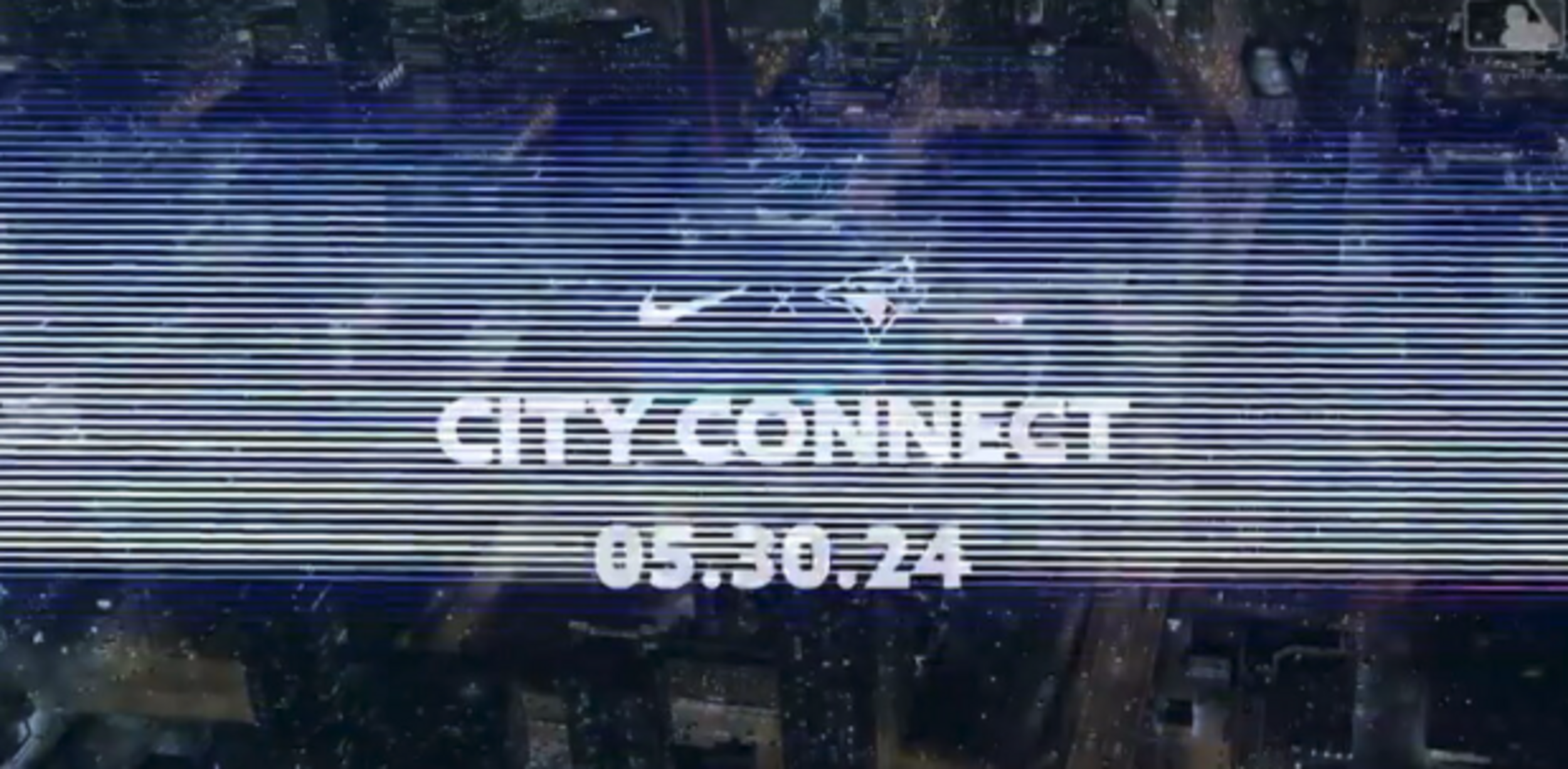
The reveal: 05.30.24
The debut: 05.31.24This one’s for the City #TOTHECORE pic.twitter.com/cMIvfwoGz3
— Toronto Blue Jays (@BlueJays) April 3, 2024
First of all, this video takes place entirely at night, which makes it feel like the uniform will be a dark tone; either black or dark blue. There has been a groundswell of interest in resurrecting the fabled “angry Jays” jersey from back in the day, so it appears black would be the predominant colour.
The Chicago White Sox pulled off a stellar black and white pinstriped City Connect jersey a few years ago, and while I don’t believe the Blue Jays will mimic the White Sox design, black would stand out compared to the blue, white, red and grey palette of the regular Blue Jays uniforms.
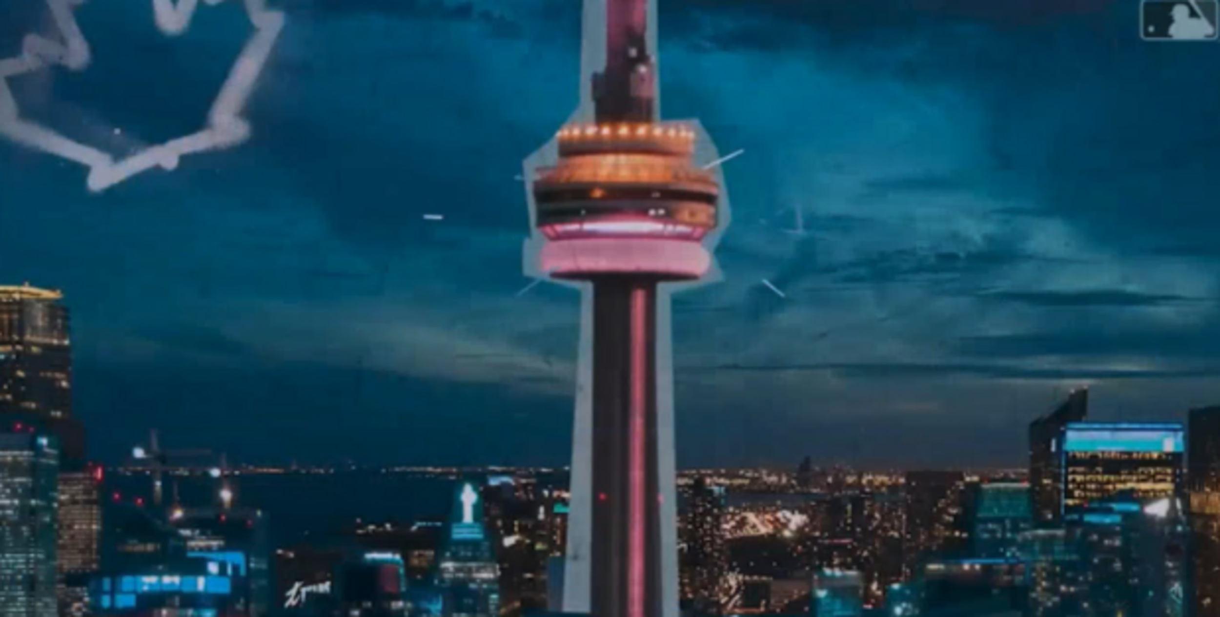
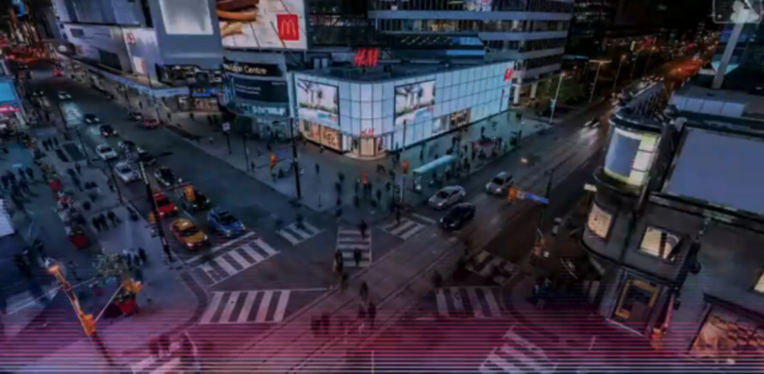
The first notable screencap is the low-hanging fruit, but it feels like the CN Tower will inevitably become part of a Toronto-themed MLB jersey. You can’t get much more literal than arrows pointing directly at one of Toronto’s iconic landmarks.
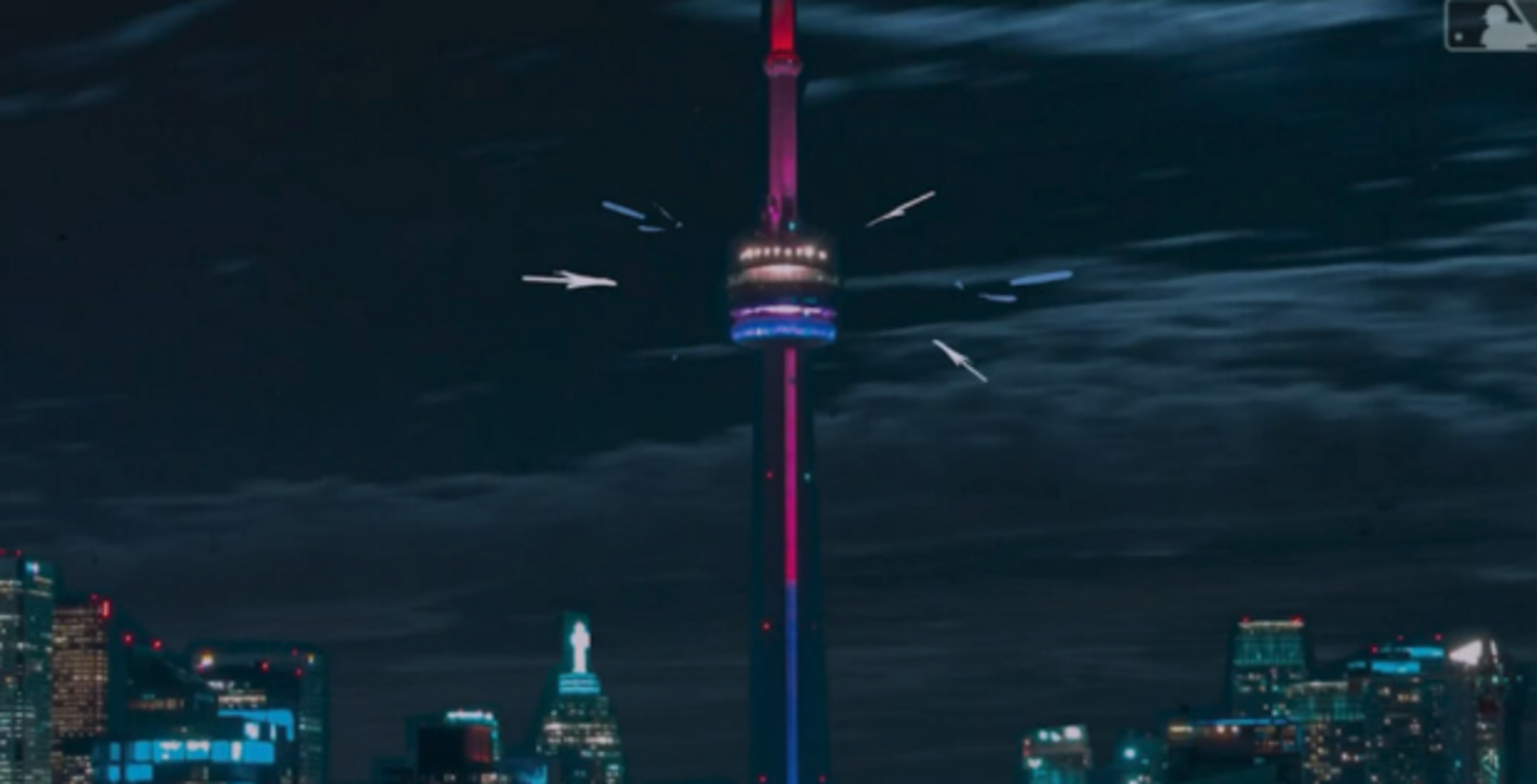
I thought some colours on the CN Tower were pretty complementary, and it turns out the pink and purple go along with the lighter colours of the arrows in the video as well.
Again, just speculating here, but those colours (whether it’s the lettering or logo design) would be a decent combination to go along with a black or dark background. Those colours also scream “nighttime” to me, for some reason.
On to the next screencap, which provides a little more intrigue about some design possibilities.
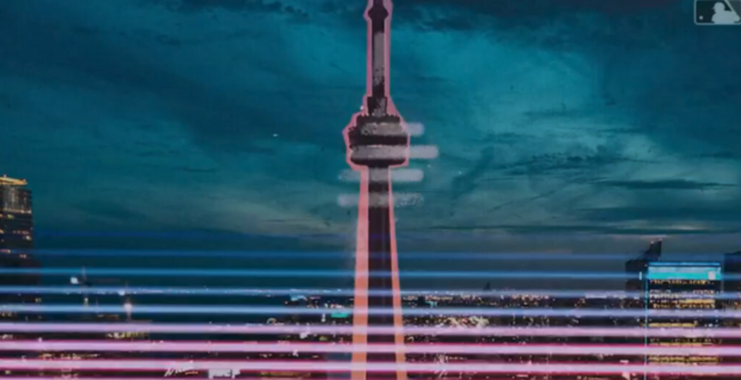
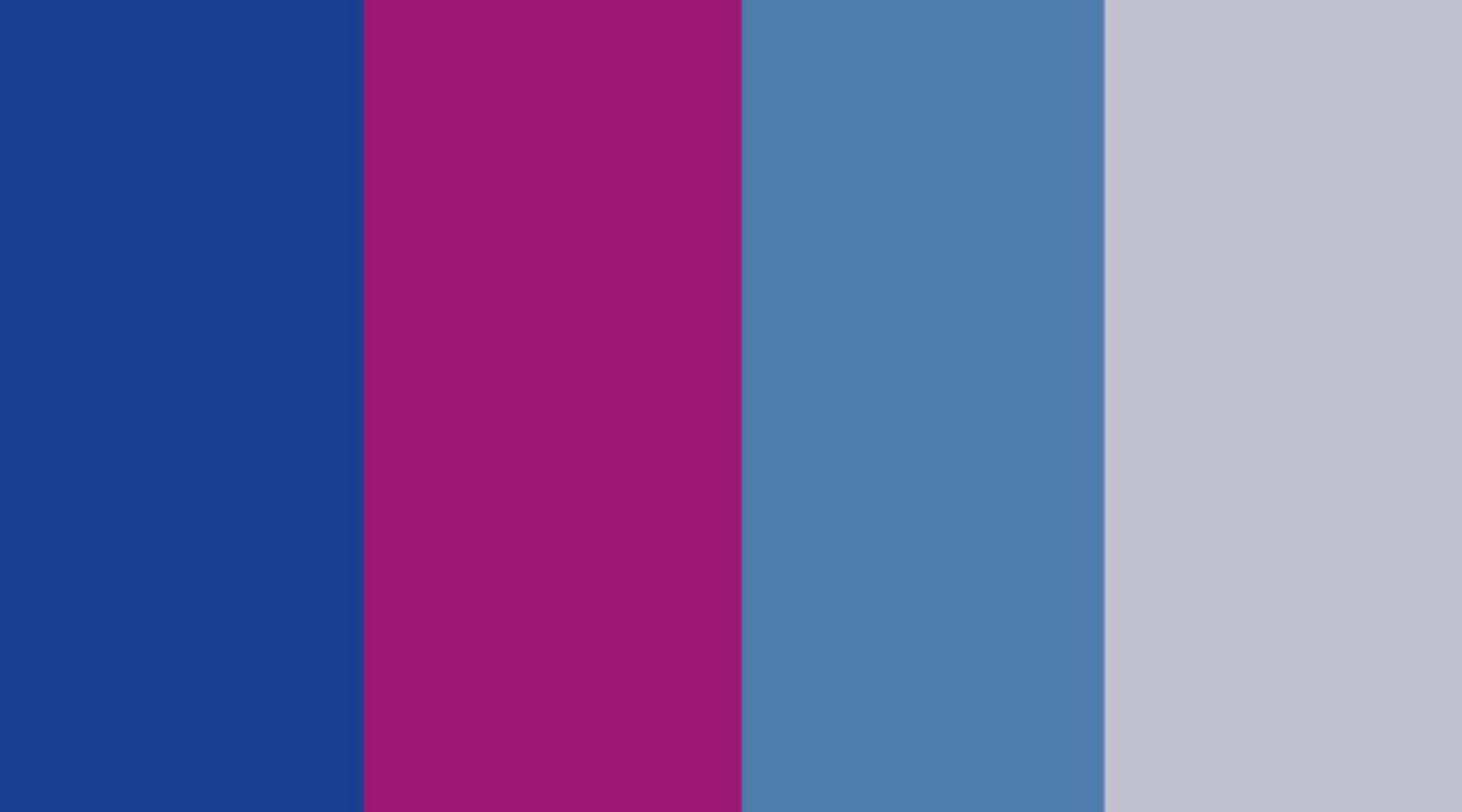
We’ve got a slightly different palette here, but that striping at the bottom is a ready-made design if I’ve ever seen one. Maybe with the CN Tower or perhaps without, but here’s what that colour palette looks like.

These tones are warmer than the previous ones, but they’re also very complementary and could work in several ways together in a City Connect uniform. And this might be a red herring, but you can briefly see the maple leaf cap logo the Blue Jays have used in the past.
Hopefully, it’s a misdirect because most fans would agree that shoehorning the maple leaf logo back into a Blue Jays uniform or cap somehow has been overdone at this point.
I don’t think it’s an accident that we see the striping carried into the rest of the City Connect teaser video. A few moments later, we see the scene change to Yonge-Dundas Square, again with that striped gradient at the bottom.
And then, in the final scene, the stripes reappear once again. This can’t be a coincidence, can it?
If you’ve been to the Blue Jays subreddit in the last few days, you may have seen /u/PhysicalLetter684’s posts with a few other breadcrumbs with some of these colours featured in pieces of equipment that Blue Jays players have been spotted with lately.
City connect colours theory
byu/Physical-Letter684 inTorontobluejays
It’s incredibly interesting that some players are suddenly wearing gear with pink and purple accents. It’s not totally far-fetched but it can’t be happenstance that some of those colours are similar to the first set of colour tones above.
City Connect colours theory pt.2- more photos
byu/Physical-Letter684 inTorontobluejays
Maybe I’m completely out to lunch here (it’s happened before in my uniform predictions), but this is my best guess as to some of the design elements we’ll see in the City Connect reveal on May 30. A black or dark jersey with lots of bright colours and perhaps some sort of striped gradient at the bottom, like in the video.
It should be noted that a precedent has been set in the past. Before the Blue Jays revealed their new powder blue uniforms at Winterfest in 2020, the team sent out teaser promotional material to members of the Toronto media. These materials heavily featured light blue, and lo-and-behold, the powder blue uniforms returned.
Completely enamoured with this embossed, blue foil, city grid insert. Would be an incredible laptop or tablet cover. #bluejays #newblue pic.twitter.com/q5pF64iidr
— Ben Wagner (@benwag247) January 13, 2020
Fans won’t have to wait much longer until they can see the City Connect jerseys in the flesh on May 30. It’s also a part of “City Connect Week”, when the Blue Jays will give away a Vladimir Guerrero Jr. City Connect bobblehead on June 3, and a City Connect backpack on June 5.
More must-reads:
- MLB rankings: The five most disappointing free-agent signings
- Surging Twins get starting shortstop back from injury
- The 'Active MLB strikeout leaders' quiz
Breaking News
Customize Your Newsletter
 +
+
Get the latest news and rumors, customized to your favorite sports and teams. Emailed daily. Always free!